My UX Design Journey
UX Design Institute 2025-2026
The Professional Diploma in UX Design covers the end-to-end UX process, from user research and analysis to interaction design, prototyping and usability testing. For my course project, I applied these methods to design a mobile hotel booking app, developing the experience from research insights through user flows, wireframes and an interactive Figma prototype.
The mobile hotel booking app
Context
You’ve joined an established company whose main product is a hotel review website. They have a strong reputation for providing travellers with trusted, in-depth reviews and ratings. After years of helping users research and evaluate hotels, the company is now expanding its offering to include hotel bookings. In addition to checking ratings and reviews, the company will begin to offer their users the ability to book hotel stays directly through the website. After years of working in the industry, the company understands that many hotel booking websites in the market are difficult to navigate
Problem statement
The company wants to stand out in the market with a website that offers a seamless, intuitive experience and guides users through the hotel booking process. As the UX designer in the company, your job is to research and design the hotel booking process for the new website.
I did the research and these are the problem statements I found during the research.
Key pain points in hotel booking apps
1. Information overload
Users are presented with too much information, too many filters, repeated content and dense hotel/room details. Important information becomes difficult to scan, particularly on mobile. In your test, the participant indicated that this level of density could make her leave the site.
2. Unclear pricing and rate options
Users struggle to understand whether a price is per night or for the whole stay, what taxes and fees are included, and why the same room has several different rates. Multiple deals, membership prices, breakfast options and cancellation conditions increase cognitive load.
3. Difficult filtering
Long filter lists make it harder to find relevant criteria. More importantly, filters do not always reflect users’ actual decision-making needs—for example, your participant wanted to search by distance/walking time to a tube station, but none of the tested platforms provided an effective filter for this. There were also cases where filter selections did not match the results.
4. Confusing calendar interaction
Date selection was not always intuitive. Users expected familiar mobile interactions such as horizontal swiping and were uncertain about how to select a date range. This indicates a mismatch between the interface behaviour and the user’s mental model.
5. Poor information hierarchy
Information users care about—such as room photos, amenities, transport proximity and room details—can be buried too far down the page or displayed too subtly. The participant particularly wanted room information immediately after viewing photos.
6. Location information is difficult to evaluate
Location is a major hotel-selection criterion, but station proximity and distance information can be small or hidden. Users may need to repeatedly open hotels to determine whether the location is suitable. By contrast, the price-on-map approach was considered useful because it supported rapid comparison.
7. Too many steps or complicated forms
Long forms and large numbers of fields increase effort during checkout. Your research found Hilton’s relatively simple three-step process easier, whereas Marriott’s one-page form presented too much information simultaneously.
8. UI elements can be misleading
Some controls did not communicate their state or function clearly—for example, a grey Select button appeared disabled, payment-card logos looked selectable when they were not, and inconsistent filter-chip styles suggested differences that did not actually exist.
9. Dark-pattern-like pressure creates anxiety
Countdown timers and preselected membership options made the participant feel rushed or pushed toward joining a loyalty programme rather than supported in making a booking decision.
The work below documents my UX design process through a series of projects completed as part of the course.
Project 1: Note-taking
Project 2: Usability test
Project 3: Affinity diagram
Project 4: Journey map
Project 5: User flow
Project 6: Sketching
Project 7: Prototype
Project 8: Prototype testing
Project 9: Annotations
Competitor Analysis
Project 1 Note-taking
Project 2 Usability Test
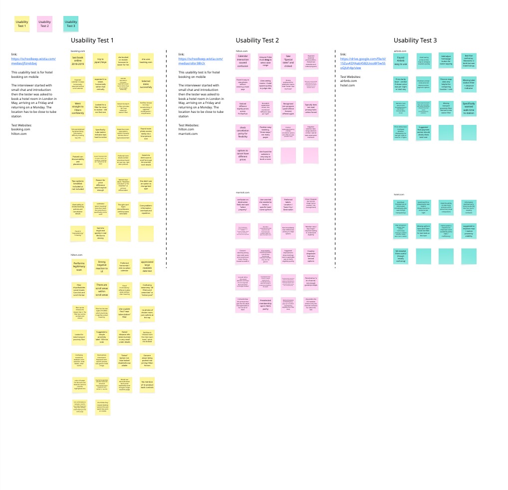
Three usability tests were conducted for mobile hotel booking interfaces, examining booking.com, hilton.com, marriott.com, airbnb.com, and hotel.com. Participants were asked to book hotel rooms in London near tube stations for a Friday-to-Monday stay in May.
Key User Behaviours
The test participant last booked online in 2018-2019 for a Tokyo trip, primarily uses booking.com, and prefers mobile booking for convenience. She has strong aesthetic preferences, wanting hotels “better than my house,” and emphasises the importance of viewing room photos quickly to judge vibe.
Critical Usability Issues
Calendar Interaction Confusion
Multiple calendar issues emerged: users expected horizontal swiping rather than vertical scrolling, were unsure whether to drag to select date ranges, and anticipated week-layout arrangements. Despite confusion, dates were eventually selected successfully.
Information Overload
Hilton.com and hotel.com overwhelmed users with dense information, repetitive content, and too many filter options. The participant noted she might exit quickly in real scenarios due to frustration. Information hierarchy problems placed critical details (room amenities, tube station proximity) too far down or in small text.
Filtering and Search Problems
A consistent critical gap across all platforms: no filter for proximity to tube stations, despite this being a key requirement. Filter-result mismatches occurred (e.g., selecting 2 beds showed 3-bed rooms). Booking.com’s extensive filter list felt overwhelming, while the scrollable filter bar with inconsistent bubble styles caused confusion.
Price Transparency Concerns
Users struggled with:
Unclear whether prices shown were per night or total stay
Multiple rate/deal options without clear differentiation
Hidden breakdown of nightly rate variations
Lack of obvious total cost at checkout
The participant appreciated booking.com’s dual display (total + per-night) and actively enabled “show with taxes and fees” to avoid surprises.
Platform-Specific Findings
Hilton.com: Easy three-step booking appreciated; multiple cancellation tiers with different prices seen as positive innovation. However, “Special rates” mismatch, preselected membership opt-in felt pushy, and grey “Select” buttons appeared disabled.
Marriott.com: Rate confusion led to preference for hilton.com. Countdown timer created unnecessary anxiety. Form complexity overwhelmed users with excessive fields on one page.
Airbnb.com: Map view with prices praised for location comparison.
Hotel.com: Strong negative UI reaction; desktop-first design apparent; navigation awkward requiring index finger due to mixed clicking/swiping interactions.
Project 3 – Affinity Diagram
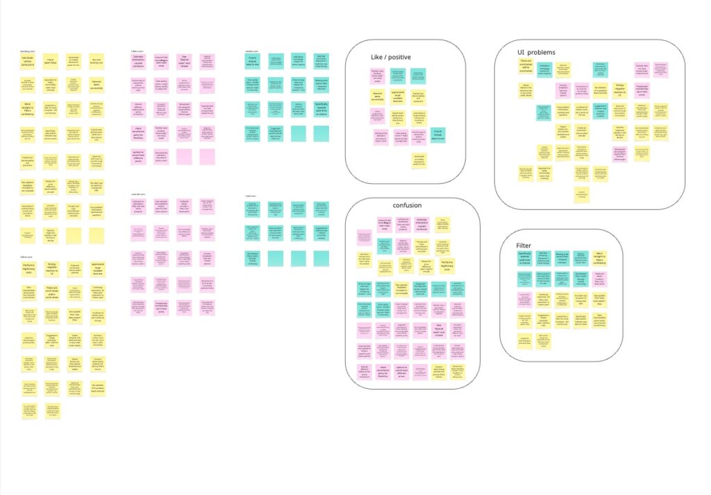
Link to Miro (Affinity Diagram)
User Profile & Context
The participant last booked accommodation online in 2018-2019 for a trip to Tokyo, Japan. She primarily uses booking.com and prefers mobile booking for its convenience. She values aesthetics highly, wanting hotels that are “better than my house,” and performs legitimacy scans when encountering new platforms.
Calendar & Date Selection
Major Pain Points:
- Calendar interaction caused significant confusion across multiple platforms
- Expected horizontal swiping rather than vertical scrolling
- Unclear whether dragging was required to select date ranges
- Week layout expectations not met
Positive Feedback:
- Appreciated large, readable date text
- Successfully selected dates once interaction model was understood
Search & Filter Functionality
Critical Missing Features:
- No proximity filter for tube/train stations across all platforms tested
- Specifically wanted walk-time to station indicators
- Missing upfront twin bed filter on some platforms
- Filter-result mismatches (e.g., filtered for 2 beds, saw 3-bed listings)
Filter UI Problems:
- Filter lists felt overwhelming and too long
- Scrollable filter bars within scrollable pages created navigation confusion
- Visual inconsistency in filter bubble styles suggested false meaning
- Confusing taxonomy (“all filters and amenities” vs. “indoor pool”)
Positive Aspects:
- Went straight to filters confidently
- Found detailed filters useful once understood
Price & Rate Communication
Confusion Points:
- Multiple deals/rates for the same room created high cognitive load
- Unclear differences among 3-4 deal options for standard rooms
- Member-only rates not clearly signaled (orange tag too generic)
- Price display ambiguity: per night vs. total stay unclear
- Breakfast inclusion not explicitly labeled as primary price differentiator
- Variable nightly rates (Fri/Sat/Sun) shown without clear explanation
- Checkout total price not obvious across payment options
Positive Actions:
- Turned on “show with taxes and fees” toggle to avoid surprises
- Appreciated having multiple cancellation options with different rates (novel feature)
- Liked seeing both total price and price per night
- Chose “cheapest but not too cheap” strategy (price anxiety management)
Suggestions:
- Show club/logo next to applicable rates for quick eligibility clarity
- Display only deals applicable to the user, not all options
- Clear labels: “Breakfast included” vs. “No breakfast”
- Prominent total cost display in final payment section
Information Architecture & Navigation
Overwhelming Experiences:
- Information overload described as “irritating” and “overwhelming”
- Dense listing information made key details hard to locate
- Would exit quickly in real life due to density
- Room details and amenities placed too far down (wanted them near top, right after pictures)
- Disliked flow: “choose room first then learn hotel”
- Confusing transitions between room selection, hotel details, and other rooms
Navigation Behaviors:
- Would use device/browser back arrow repeatedly when frustrated
- No mention of using in-product back controls
- Payment page loading issues led to impatient refreshing
Visual Design & UI Elements
Problems:
- Tube station indicators exist but text too small to notice
- “Select” button in non-blue color looked disabled/unavailable
- Room photo mismatch: expected room-specific photos, saw generic hotel images
- Card logos (Amex/Mastercard/Visa) appeared selectable but weren’t
- Scrollable areas within scrollable areas
- Different bubble styles without clear differentiation
- Not comfortable navigating pages with both clicking and swiping
Positive Elements:
- Blue picture icon for room photos highly discoverable and well-placed
- Map with prices very helpful for comparing location and cost
- Easy to view photos without entering hotel page
- Large readable text appreciated
Location & Map Features
Weaknesses:
- Map comparison weaker than Airbnb
- Had to repeatedly click to confirm hotel proximity to stations
- Distance information exists but too small and buried in details
Strengths:
- Price-on-map view very helpful
- Liked seeing prices on map to compare locations quickly
Suggestions:
- Simple proximity label (e.g., “100m to tube”)
- Improve map and station proximity visibility
Booking Flow & Forms
Hilton.com Experience:
- Found it very easy to book (“three steps,” not many pages)
- Prefers Hilton.com over Marriott.com (less rate confusion)
- Rate types communicated reasonably well
- Understood cancellation flexibility tiers and breakfast add-on
Marriott.com Issues:
- Confusing about rates compared to Hilton
- Destination field confusion: “select property” implied needing specific hotel name upfront
- Preferred labels: “Location / Town-City / Destination”
- Country dropdown very limited (no South Africa); felt excluded/”not target market”
- One-page checkout requested too many items simultaneously
- Perceived as “a lot of words,” insufficient guided prompts
- Preselected membership opt-in felt pushy
- Countdown timer created urgency/rush, increasing anxiety
- Concern about being pushed into joining Hilton Honors
Platform Comparisons
- Booking.com: Primary platform used; provided high transparency with lots of information immediately after search
- Airbnb: Easy to use; good map functionality
- Hilton.com: Preferred over Marriott for rate clarity; easy three-step booking
- Marriott.com: Confusing rates; overwhelming information; form issues
- Hotel.com: Information overload and repetition; mobile experience suggests “desktop version first, less work on mobile”
Key User Preferences
- Mobile booking preferred for convenience
- Strong aesthetic preferences for hotel selection
- Values price transparency and avoids surprises
- Reviews cancellation policies for flexibility
- Doesn’t read privacy/rules unless forced
- Wants to quickly judge hotel “vibe” through photos
- Appreciates visual comparison capabilities
Project 4 – User Journey Map
Link to Miro (User Journey Map)
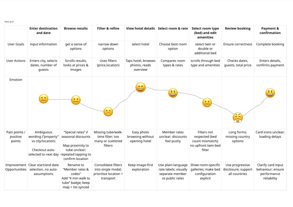
The journey demonstrates a varied emotional landscape with eight distinct touchpoints, each marked by specific emotional responses:
Initial Stages
The journey begins with a neutral state, indicating users entering the experience without strong preconceptions. This quickly transitions to a negative emotional response, suggesting an early pain point or unmet expectation that impacts user satisfaction.
Mid-Journey Experience
Following the initial setback, the journey shows recovery with positive engagement, indicating successful resolution or a compelling feature that restores user confidence. However, this is followed by a return to neutral sentiment, suggesting the experience may have plateaued or failed to maintain momentum.
Peak Engagement
The journey reaches its highest positive point with strong user satisfaction, demonstrating a key moment of success or value delivery. This represents a critical touchpoint where users find significant benefit from the experience.
Challenge Phase
A notable frustration point appears later in the journey, indicating a significant obstacle or dissatisfaction. This negative spike suggests an area requiring immediate attention and improvement to prevent user drop-off.
Resolution
The journey concludes with a progression from neutral to positive sentiment, indicating partial recovery and ending on a relatively optimistic note. This suggests users ultimately find value despite the challenges encountered.
Key Insights
The emotional pattern reveals:
- Inconsistent experience quality with multiple fluctuations between positive and neutral states
- Two critical pain points: an early disappointment and a later frustration spike
- Multiple positive moments demonstrating value delivery capabilities
- Overall resilience as the journey recovers from setbacks
Recommendations
To optimize the user journey:
- Address the early negative experience to improve first impressions
- Investigate the source of mid-journey frustration
- Maintain consistency in positive experiences
- Strengthen neutral touchpoints to create more engaging moments
This journey map provides valuable insights for prioritizing improvements and enhancing overall user satisfaction.
Project 5 – User Flow
Link to Figma file (User Flow)
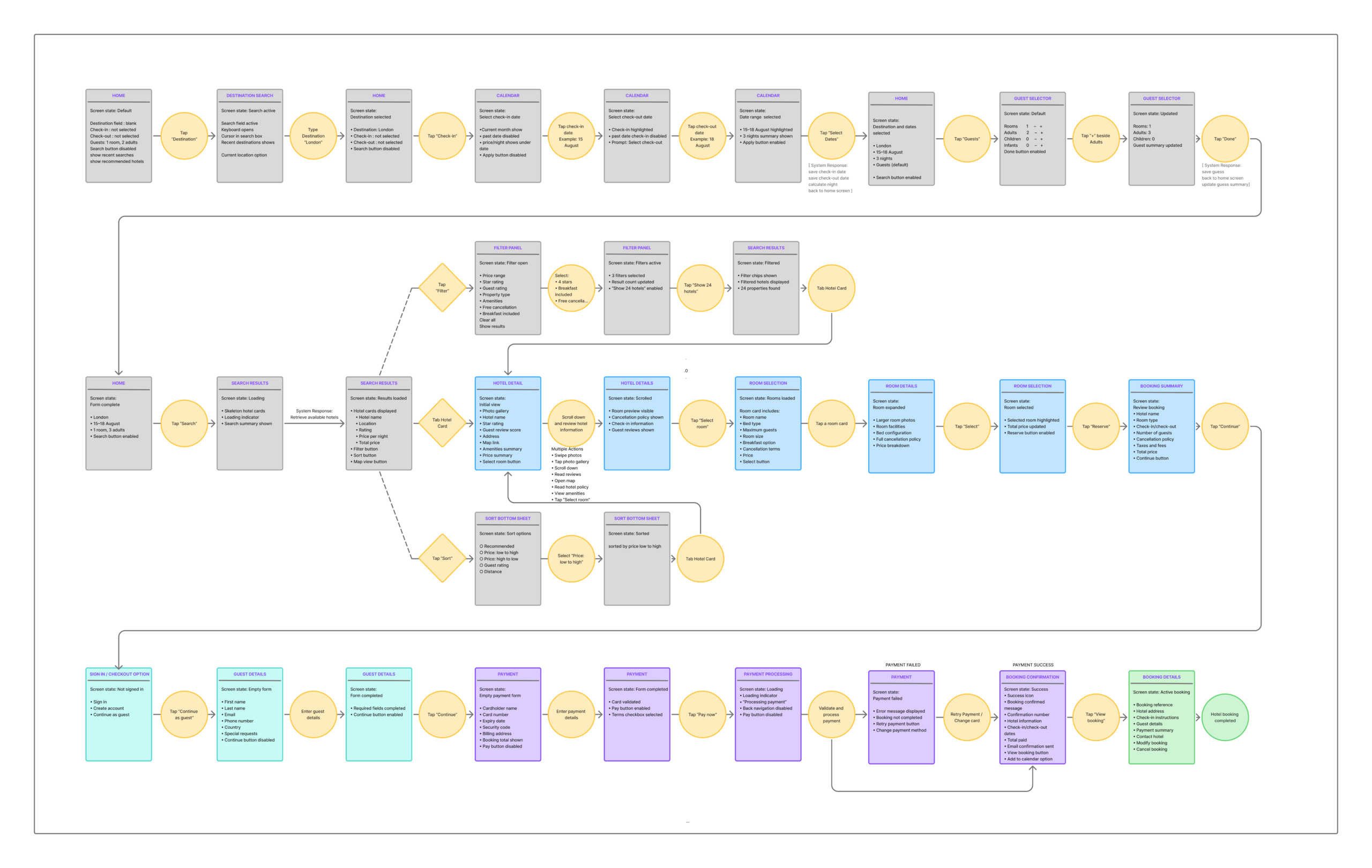
Project 6 – Sketching
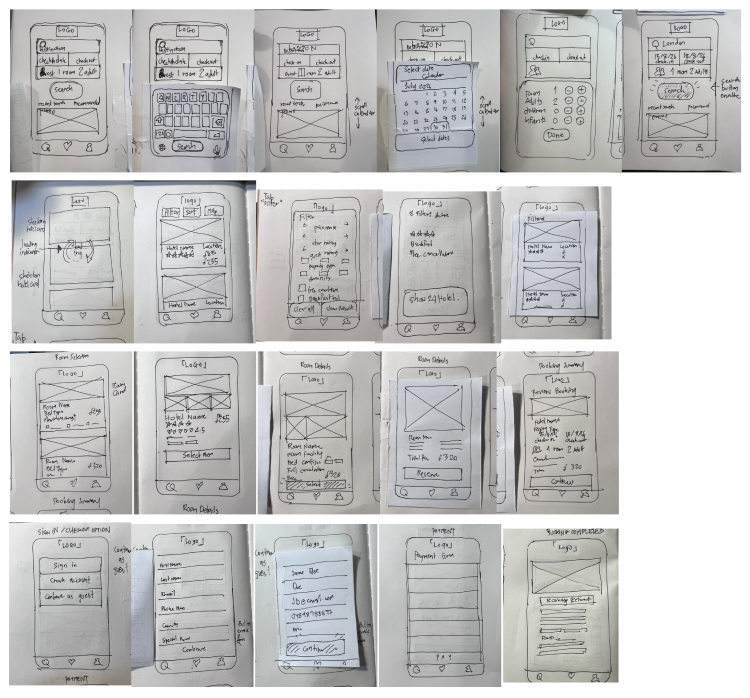
Link to Figma file (Sketching)