
Roami
Designing a simpler, more transparent hotel booking experience.
A mobile booking concept shaped by usability research, synthesis, journey mapping, wireframes and interactive prototypes.
The Challenge
The UX Design Institute brief imagined an established hotel review company adding direct bookings. I researched existing booking experiences and designed a mobile journey to help travellers find, compare and book a hotel with greater confidence.
How might we help travellers compare options and book with greater clarity?
Research
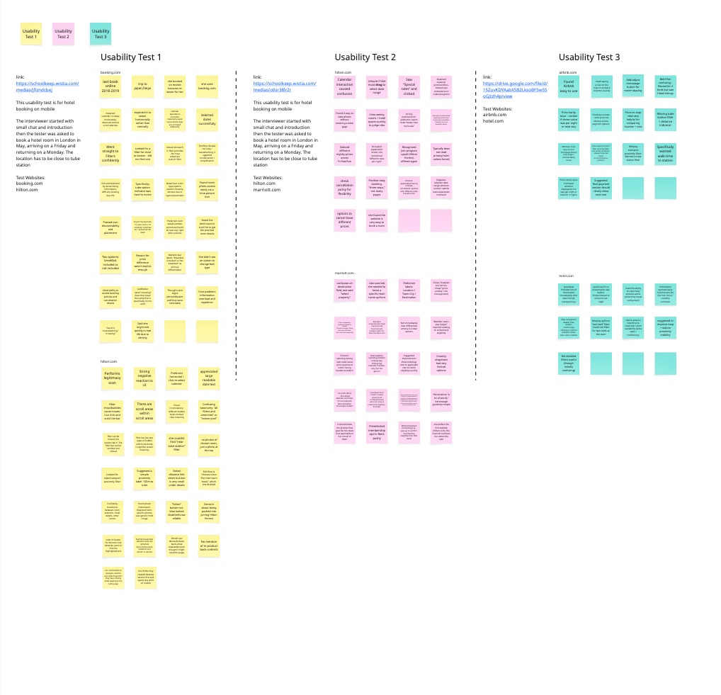
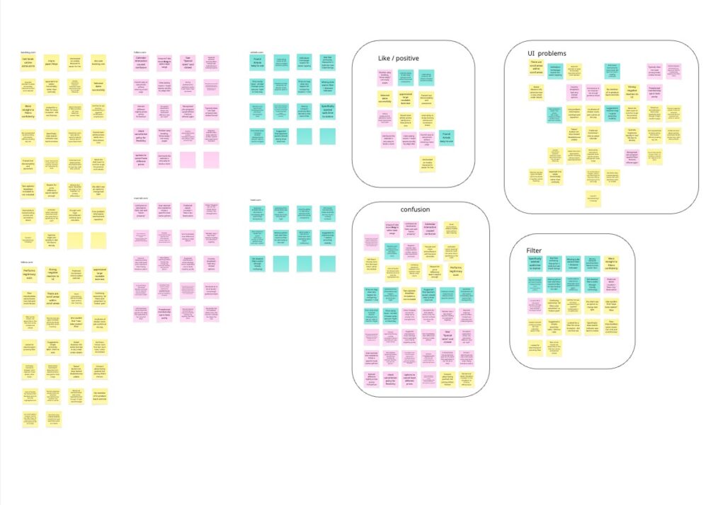
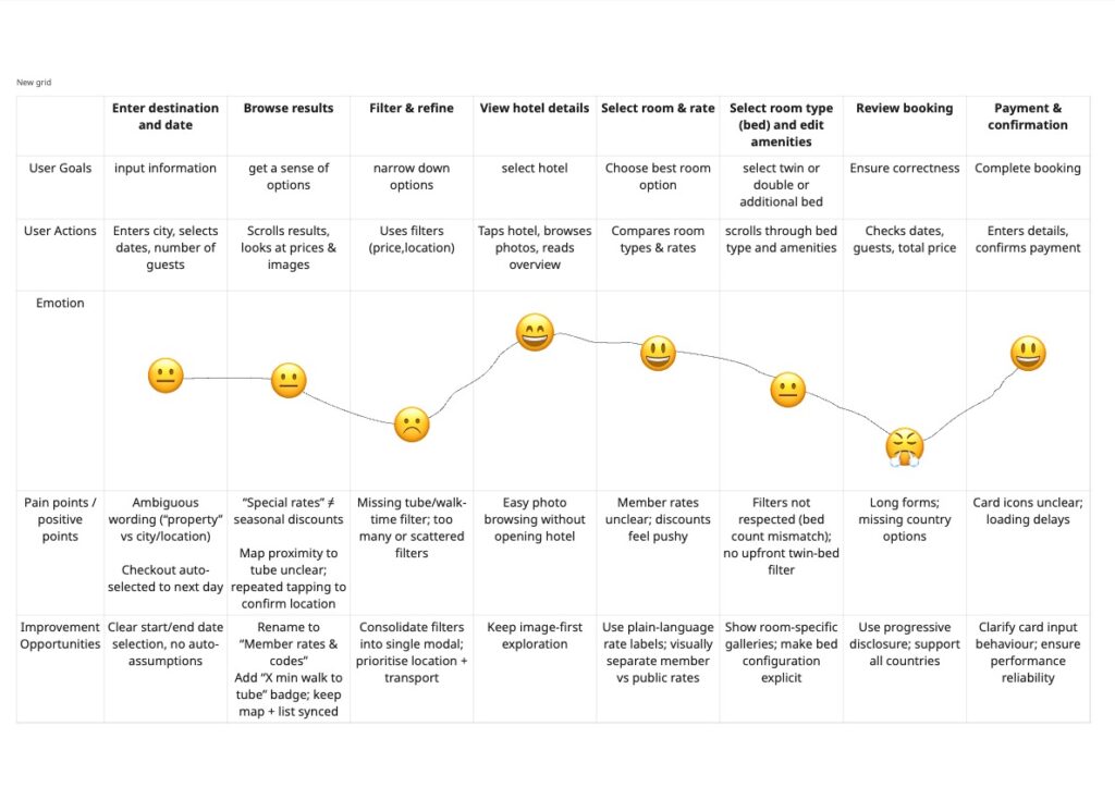
I documented three usability tests across Booking.com, Hilton, Marriott, Airbnb and Hotels.com. Participants worked through a task to find a London hotel near a Tube station for a Friday-to-Monday stay in May. I reviewed their behaviour alongside competitor interfaces, then grouped recurring issues in an affinity diagram and mapped the booking journey.
Multiple room rates and unclear tax treatment made the true booking cost hard to judge. The participant turned on “show with taxes and fees” to avoid a surprise.
The task required a hotel near a Tube station, yet walking time was small or buried and an effective proximity filter was missing.
The participant expected horizontal swiping and was unsure whether to drag across a calendar to select the stay.
Dense hotel details, long filters and repeated content made important room information difficult to scan on mobile.
Key Insights
Price transparency
Nightly rates, total prices, taxes and multiple deal options were difficult to compare.
Information overload
Dense listings hid room photos, amenities and cancellation details.
Location matters
Station proximity mattered, but was often hidden or hard to filter for.
Dates & filtering
Date-range selection and long filter lists interrupted the journey.
From research to structure
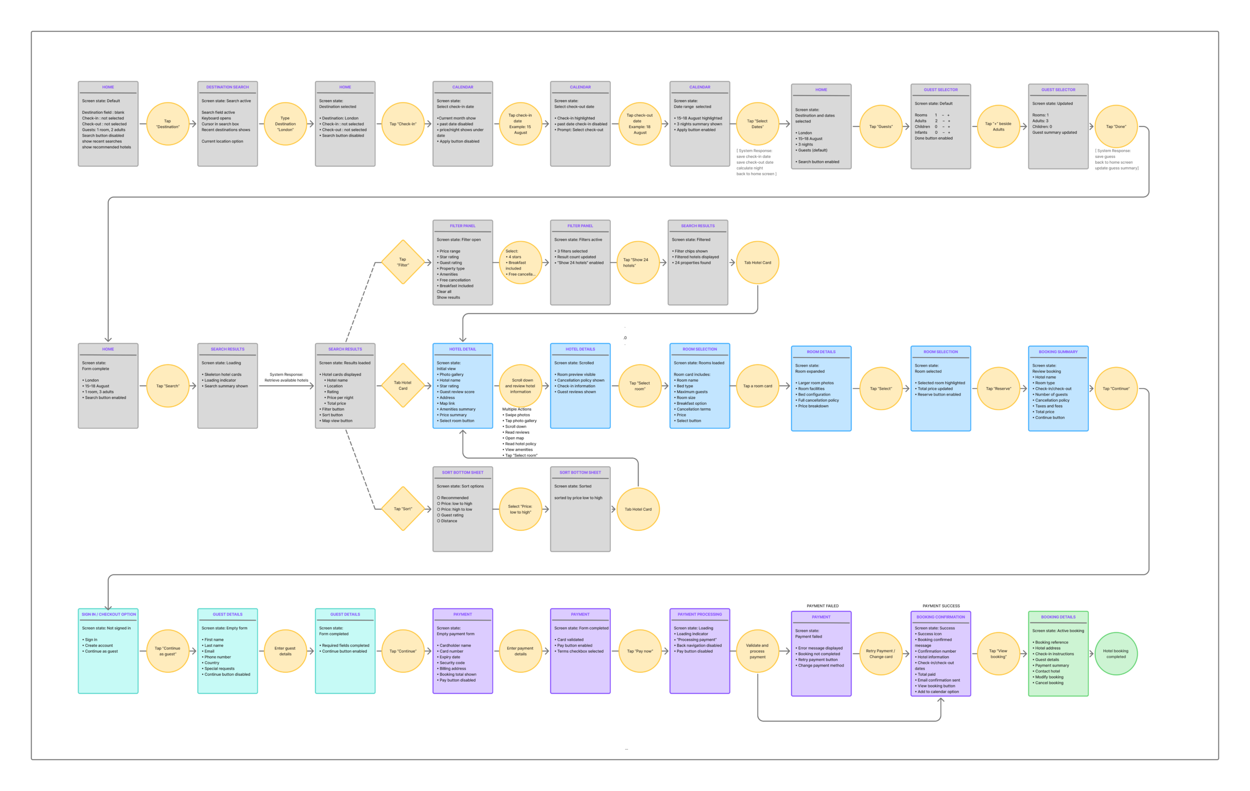
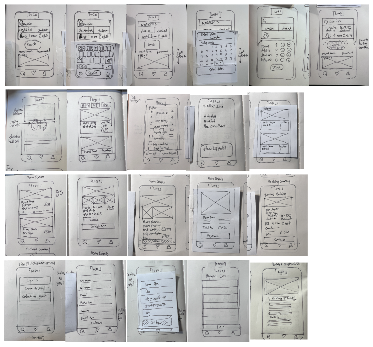
I recorded observed behaviour and moments of hesitation, clustered the notes into themes, then mapped the journey before drawing the booking flow and early screens. These are the original artifacts from the diploma project.
Design direction
Make total stay price and what is included easier to see before the final step.
Help travellers compare hotels against the places and transport they care about.
Keep dates, filters and room choices understandable on a small screen.
Explore the Design
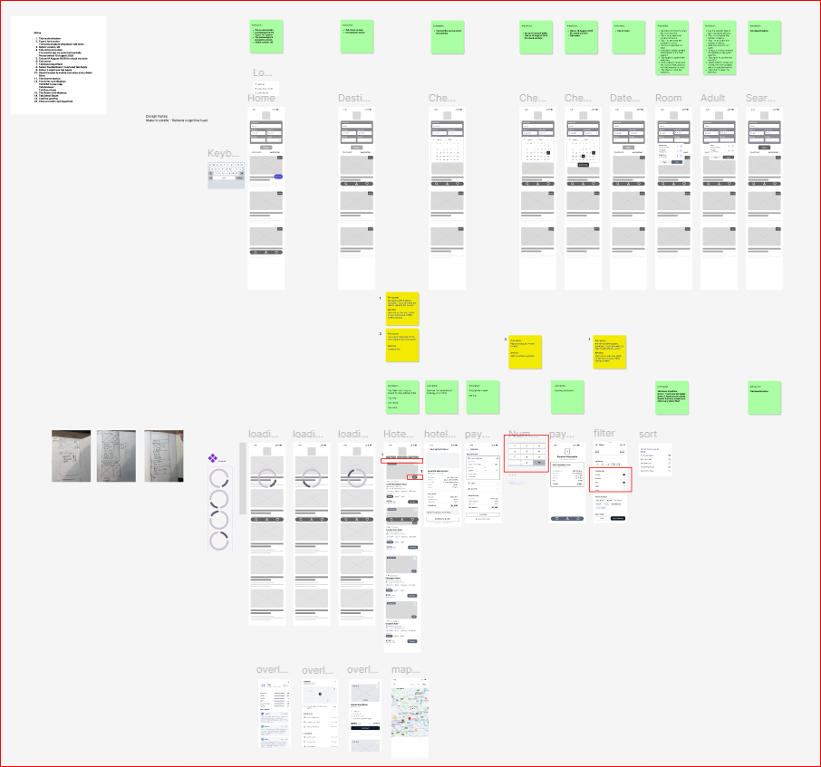
Annotated lo-fi
Lo-fi wireframes and interaction notes across the booking journey.
High-fidelity design
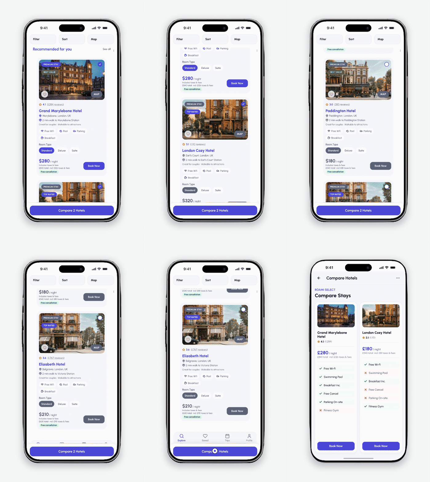
High-fidelity mobile screens for the Roami booking journey.
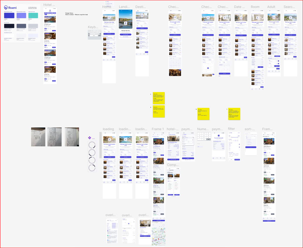
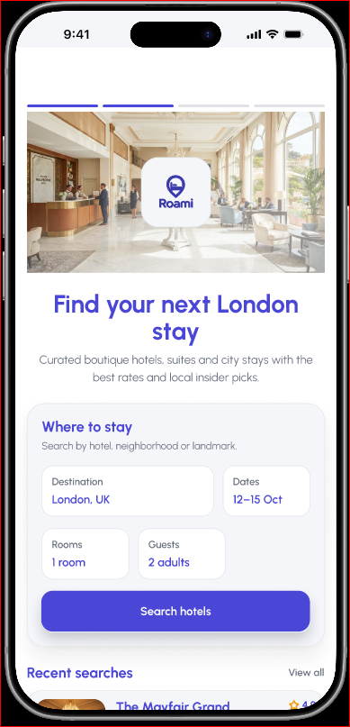
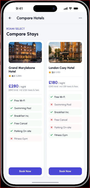
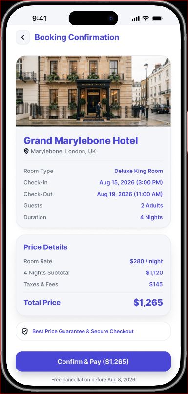
Search, compare and review a booking. Swipe across the screens on mobile.
Reflection
The project connected observed booking difficulties to a clearer mobile journey. This case study will be expanded with final screen exports and a more specific account of what changed after prototype testing.